Slint 学习笔记-入门篇
title: Slint 学习笔记 - 入门篇
author: 渊
slug: slint-study-01
tags:
- obsidian
- halo
说明
本文档和官方文档是有一定的区别的,并不是翻译官方文档,官方文档中的内容可能会和本文档内容有一定的出入(名词解释、名词称呼、标记等),或许你可以在下表中找到对应。
| 官方 | 本文更名 |
|---|---|
| Builtin Elements | 普通组件 |
| color | Color.color |
| brush | Color.brush |
| physical-length | Length.phx |
| relative-font-size | Length.rem |
| Builtin Callbacks | 生命周期 |
| length | Length.size |
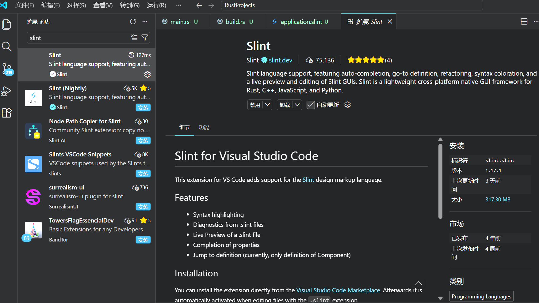
建议使用VSCode 进行 Slint 开发,插件如下
1.创建rust项目
cargo new first_window
2.Slint With Rust(安装slint)
cargo add slint
3.添加编译依赖(slint-build)
[package]
name = "first_window"
version = "0.1.0"
edition = "2024"
build = "build.rs"

[dependencies]
slint = "1.17.1"

[build-dependencies]
slint-build = "1.17.1"
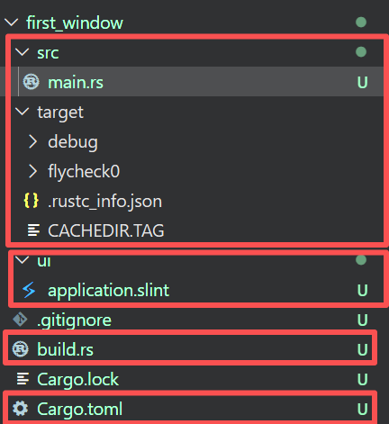
推荐是将slint 文件与 rust 分离
4.编写 slint 文件
export component MainWindow inherits Window {
    width: 1280px;
    height: 720px;
    title: "Hello World!";
    Text {
        text: "Hello, world!";
    }
}
5.编写 build.rs
fn main() {

    slint_build::compile("ui/application.slint").unwrap();

}
//引入模块
slint::include_modules!();

fn main() {

    MainWindow::new()

    .expect("Cloud not create main window")

    .run()

    .unwrap();

}
普通组件
组件需要使用 component 进行声明然后使用 export 导出
主窗体 Window
窗口需要继承(inherits)Window
示例:
export component MainWindow inherits Window {

  default-font-family: "Helvetica,Verdana,Arial,sans-serif";

  default-font-size: 16px;

  default-font-weight: 700;

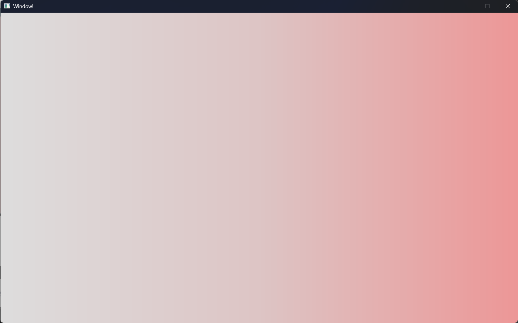
  background: @linear-gradient(90deg,#ddd 0%,#ddc5c5 50%,#ed9797 100%);

  always-on-top: true;

  no-frame: false;

//   icon: @image-url("../../imgs/rust.png");

  title: "Window!";

  height: 720px;

  width: 1200px;


}
cargo run后,如下图所示:
文本 Text
示例如下:
export component MainWindow inherits Window {

  height: 720px;

  width: 1080px;

  title: "Text!";

  Text {

    text: "I am a Text component";

    height: 200px;

    width: 100px;

    //文字换行

    wrap: word-wrap;

    color: #fff;

    font-size: 20px;

    padding: 8px;

    letter-spacing: 2px;

    //横向对齐

    horizontal-alignment:center;

    //纵向对齐

    vertical-alignment: center;

    overflow: elide;

  }

}
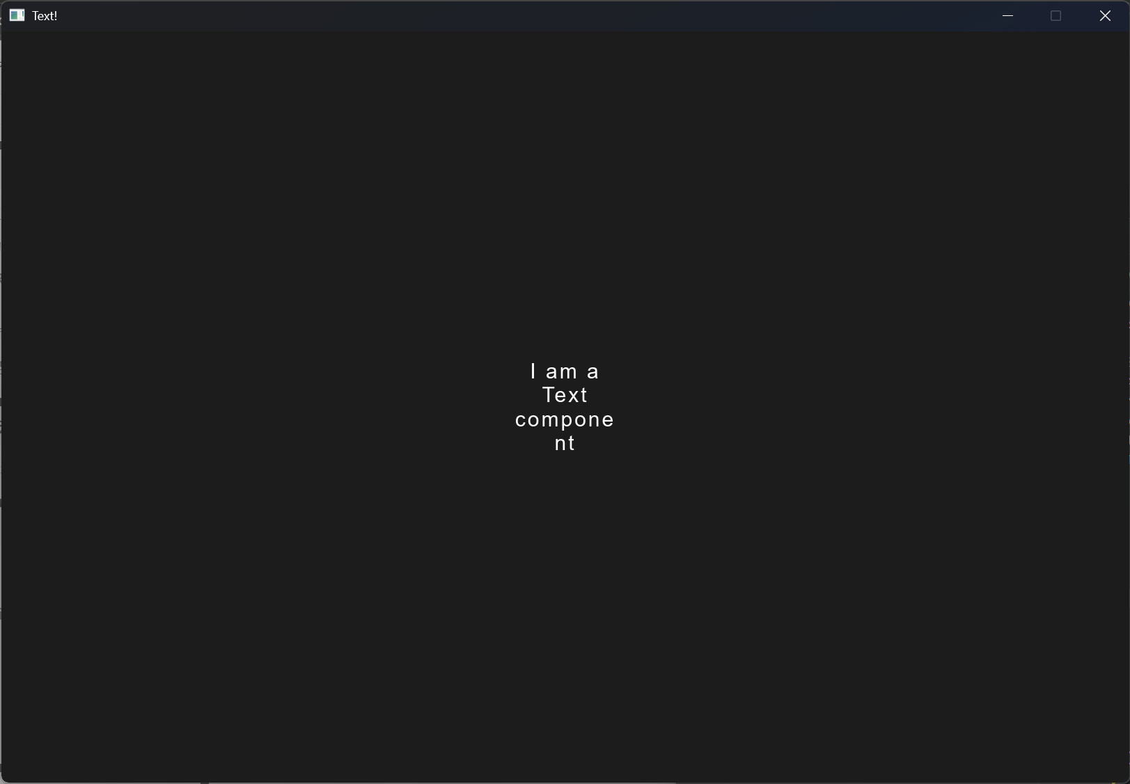
按钮 Button
示例如下:
import { Button } from "std-widgets.slint";

export component MainWindow inherits Window {

  height: 720px;

  width: 1200px;

  title: "Button!";

  Button {

    height: 66px;

    width: 310px;

    // icon: @image-url("../../imgs/rust.png");

    text: "I am a Button";

    clicked => {

      self.text = "Clicked!";

      self.width = 360px;

    }

  }

}
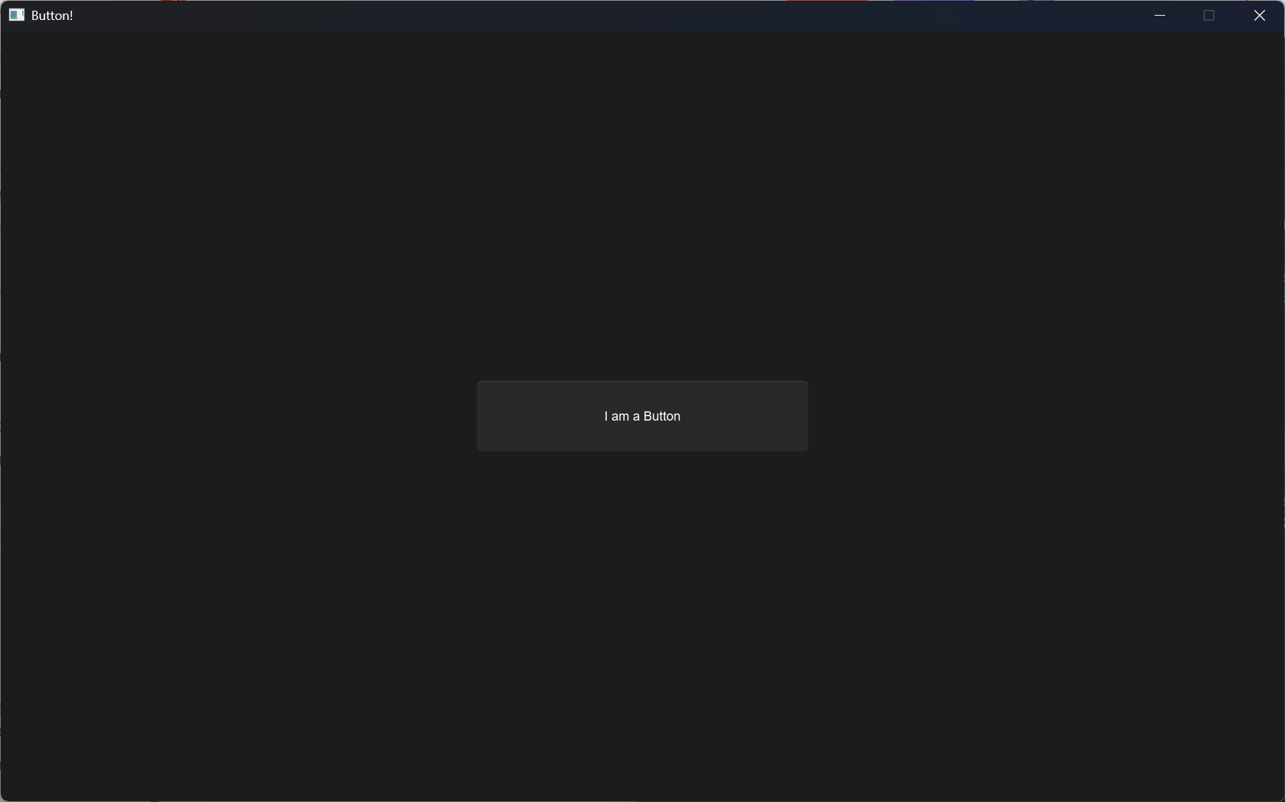
点击Button 后
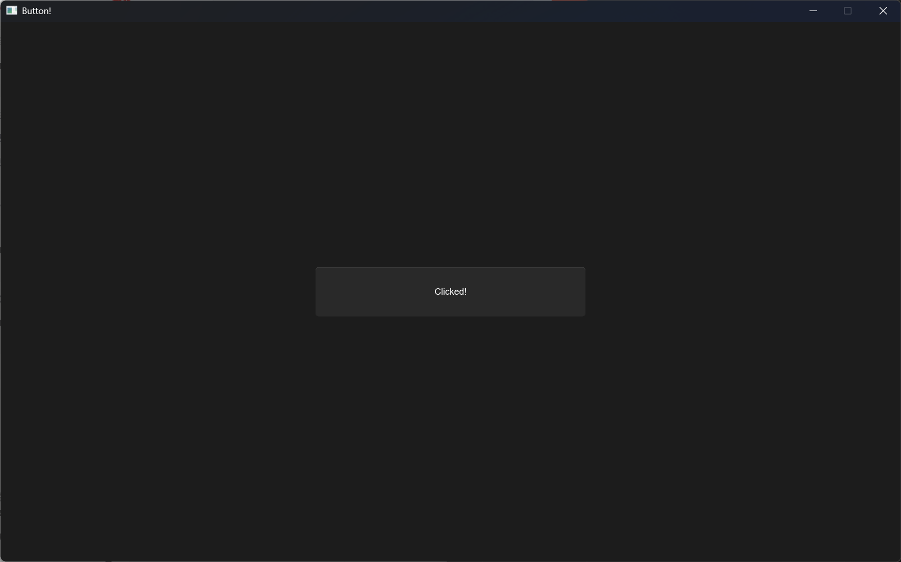
functions
| 事件名 | 说明 |
|---|---|
| clicked | 按钮点击事件 |
矩形盒子元素 Rectangle
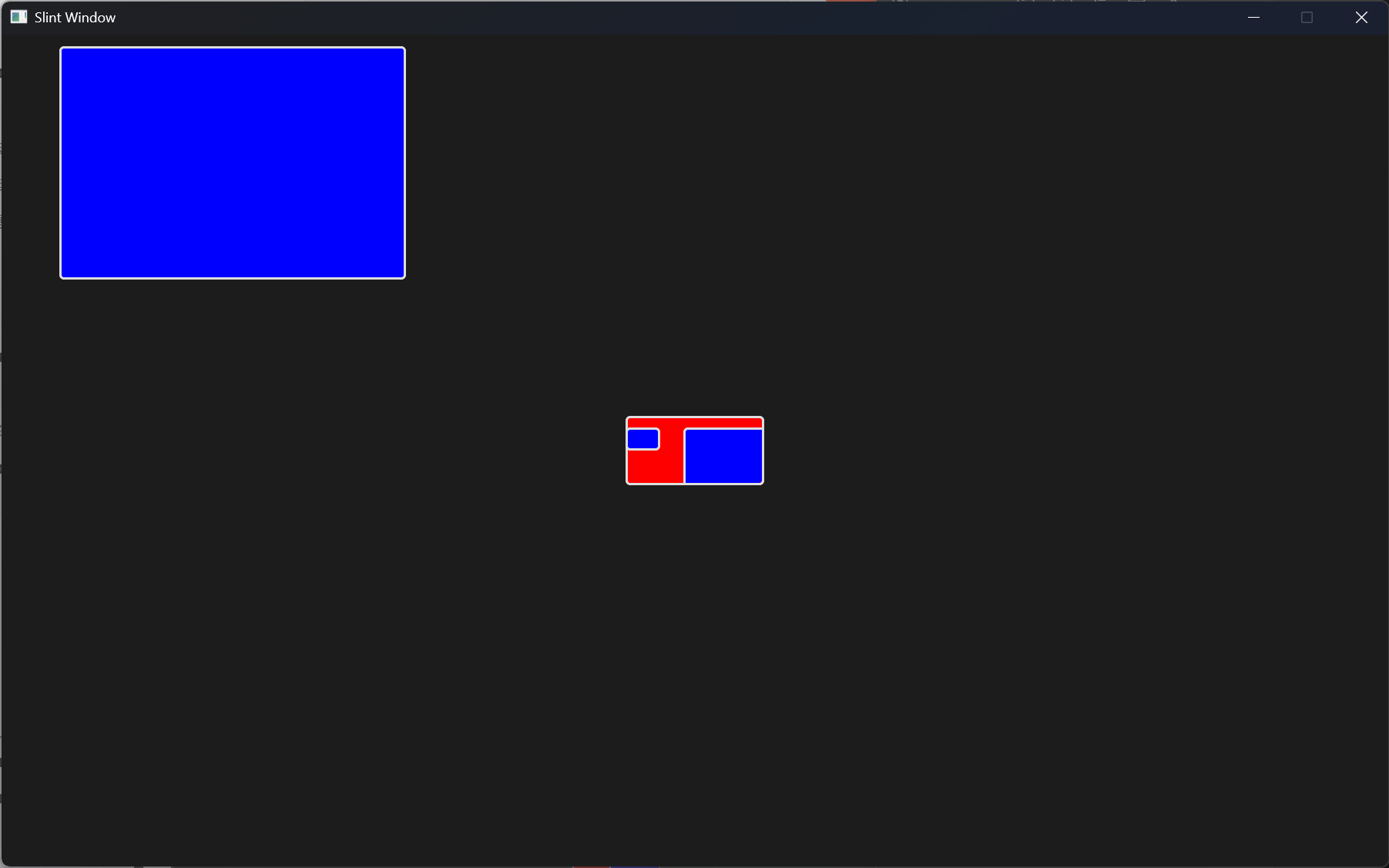
Rectangle只是一个不显示任何内容的空项。通过设置颜色或配置边框,可以在屏幕上绘制矩形。当不是布局的一部分时,其宽度和高度默认为父元素的100%。
示例如下:
export component MainWindow inherits Window {
  height: 720px;
  width: 1200px;
  Rectangle {
    background: red;
    border-color: #ddd;
    border-radius: 4px;
    border-width: 2px;
    height: 60px;
    width: 120px;
    //like overflow clip表示超出容器是否显示
    clip: true;
    Rectangle {
      background: blue;
      border-color: #ddd;
      border-radius: 4px;
      border-width: 2px;
      height: 20px;
      width: 30px;
      x: 0px;
      y: 10px;
    }
    Rectangle {
      background: blue;
      border-color: #ddd;
      border-radius: 4px;
      border-width: 2px;
      height: 202px;
      width: 300px;
      x: 50px;
      y: 10px;
    }
  }
  Rectangle {
    background: blue;
    border-color: #ddd;
    border-radius: 4px;
    border-width: 2px;
    height: 202px;
    width: 300px;
    x: 50px;
    y: 10px;
  }
}
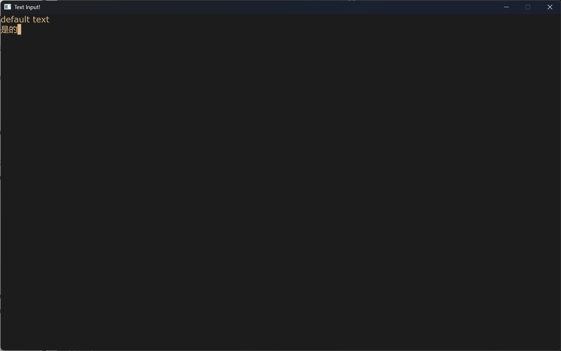
输入框 TextInput
示例如下:
export component MainWindow inherits Window {
  height: 720px;
  width: 1200px;
  title: "Text Input!";
  TextInput {
    color: burlywood;
    font-family: "Verdana";
    font-size: 18px;
    font-weight: 400;
    horizontal-alignment: left;
    input-type: text;
    read-only: false;
    selection-background-color: blue;
    selection-foreground-color: red;
    single-line: false;
    wrap: word-wrap;
    text: "default text";
    text-cursor-width:8px;
  }
}
图片 Image
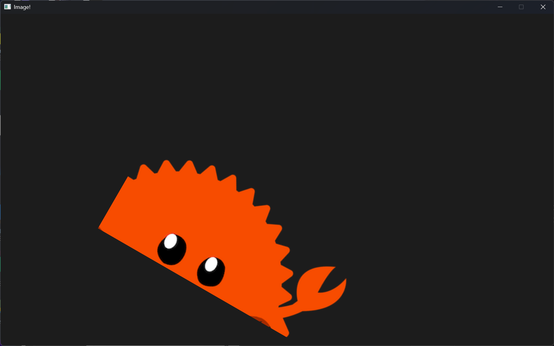
示例如下:
export component MainWindow inherits Window {

  height: 720px;

  width: 1200px;

  title: "Image!";

  Image {

    source: @image-url("../imgs/rust.png");

    image-fit:fill;

    image-rendering: smooth;

    //设置旋转中心

    rotation-origin-x: 23px;

    rotation-origin-y: 56px;

    rotation-angle: 30deg;

    source-clip-height: 200;

    source-clip-x: 100;

    height: 300px;

  }

}
滚动窗口 Flickable
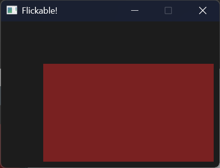
Flickable不是产生一个可滚动的窗口,而是给一个元素增加可滚动的容器。因为他是对于父容器而言,子容器可滚动,而不是使得父容器可滚动
export component MainWindow inherits Dialog {

  height: 200px;

  width: 300px;

  title: "Flickable!";

  Flickable {

      interactive: true;

      viewport-height: 300px;

      viewport-width: 400px;

      viewport-x: 0px;

      viewport-y: 0px;

     Rectangle {

      height: 200px;

      width: 300px;

      background: #792121;

     }

  }

}
网格布局GridLayout
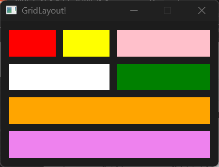
使用网格布局下的元素会被添加
- col:所在列
- row:所在行
- colspan:列占比
- rowspan:行占比
这4个属性,通常使用这四个属性进行控制
也可以使用Row{}进行行声明将在同一行的元素全部放在一个Row下
示例如下:
export component MainWindow inherits Dialog {

  height: 200px;

  width: 300px;

  title: "GridLayout!";

  GridLayout {

    spacing: 10px;

    padding: 4px;

    //使用Row进行行声明

    Row{

      Rectangle { background: red; }

      Rectangle { background: yellow;}

      Rectangle { background: pink; }

    }

    Row{

      Rectangle { background: white; colspan: 2; }

      Rectangle { background: green; colspan: 1; col: 2;}

    }

    Rectangle { background: violet; colspan: 3;row:3;}

    Rectangle { background: orange; colspan: 3;row:2;}

  }

}
横纵布局 HorizontalLayout | VerticalLayout
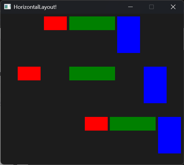
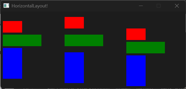
通过 alignment 属性对元素排列方式进行控制。横纵布局尝尝组合使用相互配合
HorizontalLayout
export component MainWindow inherits Window {
  height: 330px;
  width: 400px;
  title: "HorizontalLayout!";
  HorizontalLayout {
    spacing: 5px;
    padding: 6px;
    height: 100px;
    width: 400px;
    x: 0px;
    y: 0px;
    alignment: center;
    Rectangle {background: red;height: 30px;width: 50px;}
    Rectangle {background: green; height: 30px;width: 100px;}
    Rectangle {background: blue; height: 80px;width: 50px;}
  }
  HorizontalLayout {
    spacing: 5px;
    padding: 6px;
    height: 100px;
    width: parent.width;
    x: 0px;
    y: 110px;
    alignment: space-around;
    Rectangle {background: red;height: 30px;width: 50px;}
    Rectangle {background: green; height: 30px;width: 100px;}
    Rectangle {background: blue; height: 80px;width: 50px;}
  }
  HorizontalLayout {
    spacing: 5px;
    padding: 6px;
    height: 100px;
    width: parent.width;
    x: 0px;
    y: 220px;
    alignment: end;
    Rectangle {background: red;height: 30px;width: 50px;}
    Rectangle {background: green; height: 30px;width: 100px;}
    Rectangle {background: blue; height: 80px;width: 50px;}
  }
}
VerticalLayout
export component MainWindow inherits Window {
  height: 200px;
  width: 480px;
  title: "HorizontalLayout!";
  VerticalLayout {
    spacing: 5px;
    padding: 6px;
    height: root.height;
    width: 150px;
    x: 0px;
    y: 0px;
    alignment: center;
    Rectangle {background: red;height: 30px;width: 50px;}
    Rectangle {background: green; height: 30px;width: 100px;}
    Rectangle {background: blue; height: 80px;width: 50px;}
  }
  VerticalLayout {
    spacing: 5px;
    padding: 6px;
    height: root.height;
    width: 150px;
    x: 160px;
    y: 0px;
    alignment: space-around;
    Rectangle {background: red;height: 30px;width: 50px;}
    Rectangle {background: green; height: 30px;width: 100px;}
    Rectangle {background: blue; height: 80px;width: 50px;}
  }
  VerticalLayout {
    spacing: 5px;
    padding: 6px;
    height: root.height;
    width: 150px;
    x: 320px;
    y: 0px;
    alignment: end;
    Rectangle {background: red;height: 30px;width: 50px;}
    Rectangle {background: green; height: 30px;width: 100px;}
    Rectangle {background: blue; height: 80px;width: 50px;}
  }
}
画板 Path
通过描边的方式绘制形状,这里我称之为画板
- 使用
Slint的路径命令进行绘制 - 使用
SVG的路径命令进行绘制
SVG路径命令和Slint路径命令
如果指令字母是大写的,例如M, 则表示坐标位置是绝对位置;如果指令字母小写的,例如m, 则表示坐标位置是相对位置。
使用commands属性进行声明(下面以函数形式书写帮助理解):
commands:"M ..."
M(x:float,y:float):MoveTo表示这是一个新的起点,将关闭上一个绘图。例子:M 0 100L(x:float,y:float):LineTo表示从上一个点到当前点,这将绘制一条直线段。例子:L 100 100A(radius_x:float,radius_y:float,large_arc:bool,sweep:bool,x_rotation:float,x:float,y:float):ArcTo- radius_x : 内切椭圆横长半径
- radius_y : 内切椭圆纵长半径
- large_arc:在封闭椭圆的两个弧中,此标志选择要渲染较大的弧。如果属性为false,则会呈现较短的弧度
- sweep:绘制顺时针或逆时针方向(true为顺时针)
- x_rotation:内切椭圆按照x轴旋转的度数
- C(control_1_x:float,control_1_y:float,control_2_x:float,control_2_y:float,x:float,y:float):CubicTo,光滑贝塞尔曲线
- control_1_x:一号控制点的横坐标,后面也一样,这里不全写了
Q(control_x:float,control_y:float,x:float,y:float):QuadraticTo二次贝塞尔曲线Z():Close关闭当前子路径,从当前位置到起点进行连线
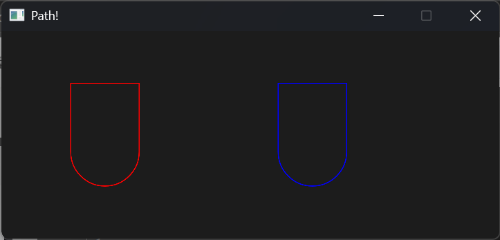
示例如下:
export component MainWindow inherits Window {
  height: 200px;
  width: 480px;
  title: "Path!";
  Path {
    width: 100px;
    height: 100px;
    x: 50px;
    y: 50px;
    commands: "M 0 0 L 0 100 A 1 1 0 0 0 100 100 L 100 0 Z";
    stroke: red;
    stroke-width: 1px;
  }
  Path {
    width: 100px;
    height: 100px;
    stroke: blue;
    stroke-width: 1px;
    x: 250px;
    y: 50px;
    MoveTo {
      x: 0;
      y: 0;
    }
    LineTo{
      x: 0;
      y: 100;
    }
    ArcTo {
      radius-x: 1;
      radius-y: 1;
      x: 100;
      y: 100;
    }
    LineTo {
      x: 100;
      y: 0;
    }
    Close {
    }
  }
}